Text sizing modes
Text elements in Creatomate offer five different sizing modes that control how font size and element dimensions are calculated. Each mode serves different use cases depending on whether you need fixed or adaptive sizing behavior.
Adding text elements
Create a text element by selecting the Text tool from the toolbar. You can then either:
- Click once on the canvas to create a text element with auto-sized dimensions
- Click and drag to define specific dimensions for the text element
The sizing behavior depends on which method you use and the sizing mode you select in the element properties.

Click once to add text with auto-sized dimensions
Click and drag to define specific dimensions
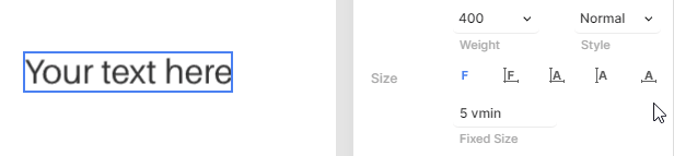
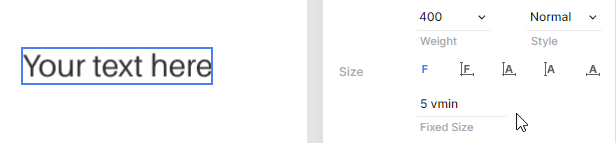
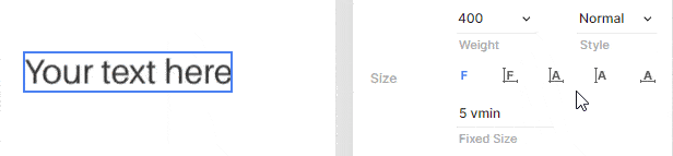
Auto-sized dimensions
The element automatically calculates its width and height based on the text content. The font size remains fixed regardless of content length.
When to use: Labels, buttons, or any text where you need consistent font size but flexible element dimensions.
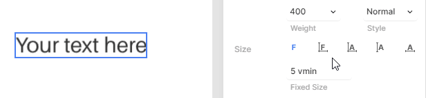
Fixed size and dimensions
Both the font size and element dimensions are fixed. If text exceeds the available width, it wraps to the next line. You can disable text wrapping in the element properties to keep text on a single line.
When to use: Design layouts where both text size and container size must remain constant.
Auto-sized text with fixed dimensions
The element dimensions are fixed, and the font size automatically adjusts to fill the available space. You can set minimum and maximum font size limits to control the scaling range.
When to use: Responsive text that needs to fit within specific layout constraints while maintaining readability.
Fixed height mode
Only the element height is fixed while the width adjusts automatically. The font size scales to fit the height constraint, and the element width expands to accommodate the content.
When to use: Creating consistent vertical alignment across text elements with varying content lengths.
Fixed width mode
Only the element width is fixed while the height adjusts automatically. The font size scales to make optimal use of the available width, with text wrapping to additional lines when necessary.
When to use: Column layouts or responsive designs where horizontal space is constrained but vertical space is flexible.